Logo Design




Logo Design Process

Customers take notice of a logo that is memorable and establishes a positive impression of your business. While the end product often looks simple, the process for getting it there can be quite complicated and time consuming.
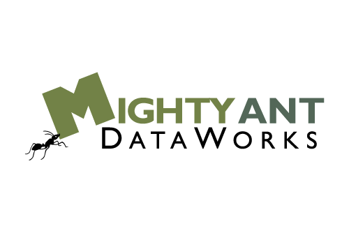
Here is an inside look at the process taken to design the Mighty Ant Dataworks logo with the help of my colleague Matt Wong, a very talented illustrator and artist.
Logo Questionnaire
This project started with our client filling out a logo questionnaire. Comprised of about 20 questions, it helped to provide details about the business, their target audience, who their competitors are, color preferences, and examples of other logos that they did and didn’t like and why. This helped ensure we were on the same page moving forward.
Logo Research
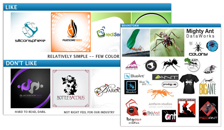
Using the questionnaire as the foundation, next we created a logo research sheet that provided a visual compilation of:
- logos our client liked and why
- logos our client didn’t like and why
- logos of our client’s competitors
- logos found online that, in this case, also incorporated an ant
This helped us to better understand the direction we should take with the logo. Here is a taste of what the logo research sheet looked like:
Rough Draft Concepts
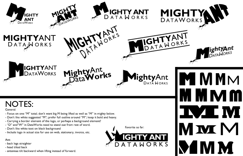
With the logo questionnaire and research sheet guiding us, we began sketching out a handful of rough draft concepts for client consideration. Since the client was looking for a very custom ant to incorporate into the logo, it was extremely beneficial to have someone of Matt’s talent with illustration available to work with. Below are a few of the rough draft concepts we came up with.

Expanding Favorite Concepts
Taking all their feedback into consideration, we began expanding on the client’s one favorite concept, experimenting with a lot of typography and layouts to arrive at the final version.
Finalizing Black and White
After a lot of good communication back and forth, we fine-tuned all the elements of the logo and came to a place where everyone was happy with the final version as presented in black and white.

Adding Color
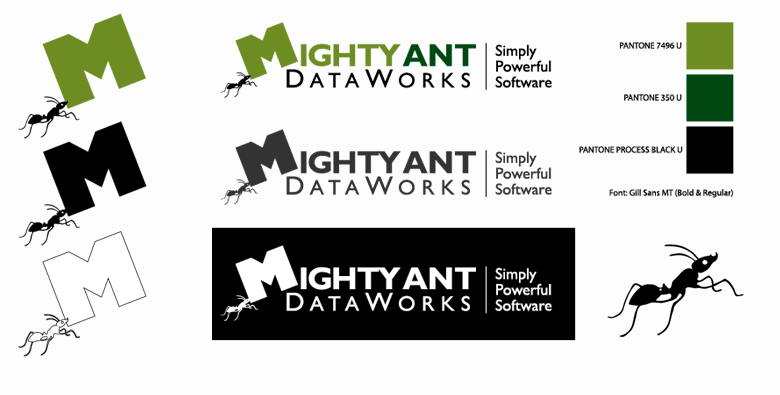
Up until this point, everything had been done in black and white because it helped us focus on the core shape and features of the logo without being distracted by color. A logo that works well in black and white is extremely versatile. Adding color gives it that extra punch and helps lay a strong foundation for the company brand. In the case of Mighty Ant DataWorks, we knew we wanted a natural, fresh color like green. Here is a small sampling of the color sheet:

Delivery
With the colorized version approved, we created a master-file in Adobe Illustrator that included the color, black on white and white on black versions of the logo. It also included an emblem version with just the ant holding the “M” and a list of the specific colors and fonts used.
Summary
Working closely with our client, we were able to create a unique, powerful logo that helped exemplify the core business and establish a firm branding foundation for Mighty Ant DataWorks. In the end, a happy client was the bow that wrapped this project up for us.

Here’s what he had to say:
“Thomas Dale is a delight to work with. He’s easy going, helpful, and talented. We like what he’s created for us, and, more importantly, our customers have liked it too. Thomas Dale is great to work with, and produces great work — we highly recommend him.”
Glenn Smith, President,
Mighty Ant DataWorks
About Mighty Ant DataWorks:
Mighty Ant DataWorks provides custom database and web development, FileMaker consulting, and mobile database development for iPad, iPhone, FileMaker Go, and other iOS devices. FileMaker Business Alliance member. To learn more, please visit mightyantdataworks.com.
About Matt Wong Art
Matt Wong is a talented concept artist and illustrator providing custom work for hotels, graphic novels, game apps and more.
Any Questions?
If you are interested in having a custom logo created for your business or have any questions at all, please use this contact form to reach out.
